

menu
close
Developing our core interactions and UX/UI patterns for V1 of the Hippo mobile app.
One of my contributions to the design of the Hippo mobile app was conceptualizing and designing user interaction patterns. These micro-interactions interactions would be core to our app, taking the user from a to b throughout various use cases. My challenge was to cause users to feel as though they were moving through the app in a smooth, contemporary way.
Product Designer
Figma
Adobe After Effects
Lottie
Product Designer (me)
Product Stakeholder
Business Stakeholder
The User
Our target user is a 40-50-year-old who is interested in taking a “modern” approach to life and is open to learning more about emerging tech. They browse websites, shop online, and are learning how helpful and expansive technology can be. Most might not be as familiar with using an app to control their smart home devices.
We wanted to create an app that appealed both to our current user base and the younger, tech-savvy generation of new homeowners. To appeal to this modern user base, we wanted to institute moments of delight within the app and think beyond just function.
The Process
Under the guidance of Hippo's Design Director and multiple c-level stakeholders, two other designers and I started early explorations for the design of Hippo's first mobile app.
I was given a brief of the different interactions that would be needed throughout the app. Working with my PM and engineering, we worked through each specific use case that could happen between the interactions. Each of these interactions had a few different use cases. These were divided into: Loading Animation, Splash Page, Access Code Processing, and Transitions Between Pages.
We knew we would be rebranding the app shortly. Since the overall brand feel was going to change dramatically, the interactions would need to be evergreen for both brands.
Our new brand reflected a more modern user base compared to our previous branding. Stakeholders wanted to see something new that denotes moving forward.
Engineering specified the exact timing needed to process the backend, confirmations, general loading, etc. The animations needed to fit within each exact time frame.
These animations would be used while loading web pages, PDFs, and certain parts of user flows. Traditionally, a spinner would be used, but we wanted to create something new and more Hippo.
As mentioned before, we knew this app would be rebranded soon. Because we knew our logo wasn’t going to change, I initially explored animations with this in mind. I also thought of using iconography that could be easily replaced with our new style.
As a designer on a small team, you’re constantly working on different projects at once. Multiple deadlines, timelines, ideas, and meetings – this is what makes design so much fun!
Because of its success and as a lighter lift for engineering, we re-used my home loading animation from the Lead Generation Funnel Project. To create this animation, I focused on four aspects of the animation: resembles loading, denotes moving forward, easily loops, and is unique to home insurance.

This is the first thing a returning user will see when they enter the app. It was essential to set the tone of the app and take advantage of a branding moment while the back end is loading. Depending on how this piece was designed, it could also influence the rest of the patterns. In the end, there were three iterations that my PM and I presented to stakeholders.
.gif)
After presenting the iterations, it was clear that we wanted to use the animation that incorporated the Hippo, our secondary logo, himself – a moment of delight that showcased our brand.
This aspect of the interaction process was two-fold. We needed to see what the animation itself looked like, as well as show how it leads to each different use case.
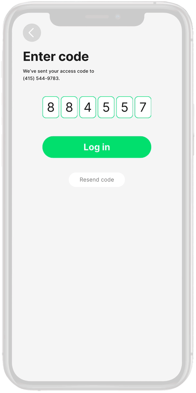
We were working under the assumption that the user would need to click the CTA in order to process the 2-step verification code through the back-end. As you can see, the focus is on the transition from the code screen to the home page. Press "r" letter key to return to the main menu on the prototype.

Happens to all of us… My PM and I assumed that the user would need to click the CTA to process the code. After multiple rounds of design and iteration, engineering revealed this is not true. If typed in correctly on the first time or if using auto-fill, the backend would automatically process without the user needing to click anything.
Working off of our new knowledge from the engineering team, we rethought the animation and how the user interacts with the page. Reminder, it's most likely that the code will process without the need to click the CTA. However, we needed to keep the CTA if the user didn’t get it right the first time.
I now needed to backtrack and think about the actual code processing would work without the need to press a button, THEN the transition itself.
Inspired by working on the animation for the Splash page, I used the same line movement to mirror the line in our Hippo logo. Stakeholders loved the movement of the line, but it was too long of an animation and needed a bit of streamlining.
The final iteration denoted moving forward, worked for any processing time, and tied in with a pattern I just created!

